Friday, October 19, 2012
Monday, October 15, 2012
Wednesday, October 10, 2012
What type are you? Live Blog-Pat Wright Part 2
Rule # 3 Use different angles. Move around up or down, not just a straight shot to get the best shot.
Rule # 4 Use different Camera lenses.
Be aware of the light, it can change the look and color of the shot.
Rule # 5 Rule of thirds
Incorporate surrounding area with subject.
Tips
Take more than one shot.
Carry more than one media cards.
Carry batteries
Set camera time/date together
don't stamp the picture
Keep image resolution on its highest resolution
Experiment w/ light settings
Carry lens tissue
Be aware of lens smudges
HW
Take more photos employing the new photography principles.
Post the photos and how you employed the photographic principles.
Monday, October 8, 2012
Pat Wright - Photography - Live Blog
Composition - everything that affects the shot (lighting, etc.)
Incorporate places, people, and activities so that the photograph appears natural.
Show people in their environment.
People don't have to pose for a good picture.
Tight shots.
Be aware of the surroundings that will affect the shot.
Photography is very subjective.
Rule's of Photography:
Shoot tight...keep empty space to a minimum
Shoot sharp....hold camera still or use a tripod
Use a tripod for best shots
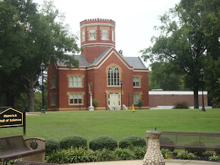
Above are some shots taken around campus applying Pat Wright's design principles.
Saturday, October 6, 2012
Create a Movie Poster
If my book was a movie this is what I think the Movie Poster might look like. I chose the rocks for the background, because when I think of Zen I think of these time of rocks. I added shaped behind some of the text to make it stand out more, the texts also shows some contrast that flows throughout the image of royal blue and white. I also used some different typefaces within the poster; Bodoni MT Condensed, Bodoni MT, Goudy Stout, & Forte. I used concordance with similar fonts different emphasis underlining and enlargement. My Conflicts I used were using Bodoni MT, Bondoni Condensed, and Onyx. I used transparency in shapes as a way to try to make some of the texts stand out, and I also shadowed & embossed some text.
Wednesday, October 3, 2012
Photo editing (Photo Compression)
1024x633 (Original)
289x179 (original)
http://commons.wikimedia.org/wiki/File:Butterfly_53_%284529688386%29.jpg
This image came from wikimedia, credited to Magnus Menske, Licensed under CC2.0 and copyleft.
1023x921.(original)
511x460
This image is under the Morgue File License. License Explanation Image
http://commons.wikimedia.org/wiki/File:Butterfly_53_%284529688386%29.jpg
This image came from wikimedia, credited to Magnus Menske, Licensed under CC2.0 and copyleft.
1023x921.(original)
511x460
This image is under the Morgue File License. License Explanation Image
Friday, September 28, 2012
This particular sign from Grace Park shows contrast. "GRACE" is in one size font, and typeface, while "park" is in another size and font face, it is also a different color. The text is center aligned, with no space between each word. This sign is a great example of contrast, as well.
This sign is a great example of concordance. It has the same typeface, but "HOLSTEIN" is bold and much larger than the rest of the text on the sign. Each group of text is is different font sizes, and creates a triangular look but is all center aligned, with "~EST.1887~ being the smallest font size. Same font different sizes and emphasis.
This sign is a great example of concordance. It has the same typeface, but "HOLSTEIN" is bold and much larger than the rest of the text on the sign. Each group of text is is different font sizes, and creates a triangular look but is all center aligned, with "~EST.1887~ being the smallest font size. Same font different sizes and emphasis.
Subscribe to:
Posts (Atom)


