Wednesday, October 24, 2012

Shooting Different Angles (Photography)


 The first group of photos I took as the sun was going down, and I think that almost "twilight" hour helped make most of the pictures I took look really great. I took each photo from different angles; close, far away, from up high, down low, the side. I focused on the archway and then with the flowers after I took the group of photos of the archway. I used the rule of thirds in these photos as well. I also tried to keep the photos proximal to the archway and the flowers, although some distractions, such as the car in the background could not be avoided.


  This is my favorite because it almost looks like he is standing against the tree, but he actually never moved and is standing far from it.
For this group of photos, I took images of Taylor and Caleb as they were talking in front of Curtis. Again from different angles and attempting to keep them within a third of the frames, as. Also I tried to keep the distractions at  a minimum in the background and keep the main focus on them. The lighting was behind them therefore the lighting on their faces changed, and in some frames showed their shadows.

Wednesday, October 10, 2012

What type are you? Live Blog-Pat Wright Part 2

Rule # 3 Use different angles. Move around up or down, not just a straight shot to get the best shot.
Rule # 4 Use different Camera lenses.

Be aware of the light, it can change the look and color of the shot.
Rule # 5 Rule of thirds
Incorporate surrounding area with subject.


Tips
Take more than one shot.
Carry more than one media cards.
Carry batteries
Set camera time/date together
         don't stamp the picture
Keep image resolution on its highest resolution
Experiment w/ light settings
Carry lens tissue
       Be aware of lens smudges

HW
Take more photos employing the new photography principles.
Post the photos and how you employed the photographic principles.

Monday, October 8, 2012

Pat Wright - Photography - Live Blog

Composition - everything that affects the shot (lighting, etc.)

Incorporate places, people, and activities so that the photograph appears natural.
Show people in their environment.
People don't have to pose for a good picture.

Tight shots.
Be aware of the surroundings that will affect the shot.
Photography is very subjective.


Rule's of Photography:
Shoot tight...keep empty space to a minimum
Shoot sharp....hold camera still or use a tripod
Use a tripod for best shots


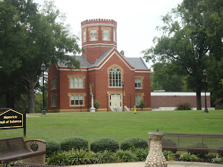
Above are some shots taken around campus applying Pat Wright's design principles.

Saturday, October 6, 2012

Create a Movie Poster


If my book was a movie this is what I think the Movie Poster might look like. I chose the rocks for the background, because when I think of Zen I think of these time of rocks. I added shaped behind some of the text to make it stand out more, the texts also shows some contrast that flows throughout the image of royal blue and white. I also used some different typefaces within the poster; Bodoni MT Condensed, Bodoni MT, Goudy Stout, &  Forte. I used concordance with similar fonts different emphasis underlining and enlargement. My Conflicts I used were using Bodoni MT, Bondoni Condensed, and Onyx. I used transparency in shapes as a way to try to make some of the texts stand out, and I also shadowed & embossed some text.

Wednesday, October 3, 2012

Photo editing (Photo Compression)


 1024x633 (Original)


289x179 (original)

 http://commons.wikimedia.org/wiki/File:Butterfly_53_%284529688386%29.jpg
This image came from wikimedia, credited to Magnus Menske, Licensed under CC2.0 and copyleft.


1023x921.(original)

511x460
This image is under the Morgue File License. License Explanation Image